Web Design Case Study: Plugging the branding of a regional Deep Tech unicorn within its recent FinTech acquisition.
About the Company:
A regional technology-based financial company with a product portfolio of payment gateways and fraud detection, who was officially acquired by a multinational unicorn.
Brief:
The company did not have its website updated for more than five years. The present version was dated, and not a proper representation of its improved product, service and growth. Based on a recent study of its existing & potential client base and competitors, the company was struggling with its skewed image led by its digital assets especially the website.
Post-acquisition, they kicked off a full website revamp process to resonate with its vision to become the most friendly payment gateway for all businesses especially the startup and new business cohort.
Goals |
Approach |
Result |
|
|
|
|
|
|
|
|
|
Technical Requirements |
|
|
|
|
|
|
|
|
|
|
|
Approach:
The brand came with concerns and issues associated with their website that had an outdated look, feel, and function.


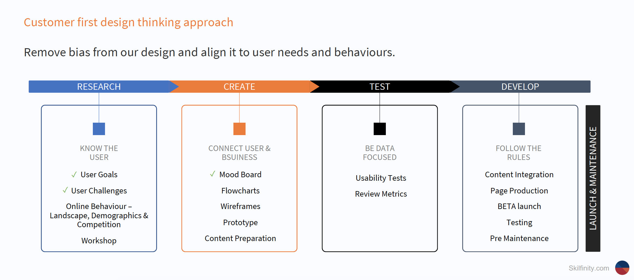
Led by Customer-first design thinking approach and exhaustive competitor research, we created user personas. Our Design, Development, and SEO teams worked collaboratively together with the client’s marketing team to create a unique and functional website that would have subtle brand reinforcements of the acquirer company without losing its innate identity. The site needed to be functional, easy to navigate, and offer a seamless sign-in/onboarding experience for its target customers.
Tech stack: Node.js web application on AWS.
Planning your next website refresh? Connect with us to design and develop your next mobile-first website or build your app.


